Brand identity refresh of a yacht week organizer that offers unforgettable adventure, parties and touring sunny beaches on a flotilla of sailing yachts to young adults globally.
Read details
With its primary focus on the Pacific region, The Whitsundays Week attracts young adults from all over the world. In order to better resonate with their target audience, they sought to revamp their brand identity.
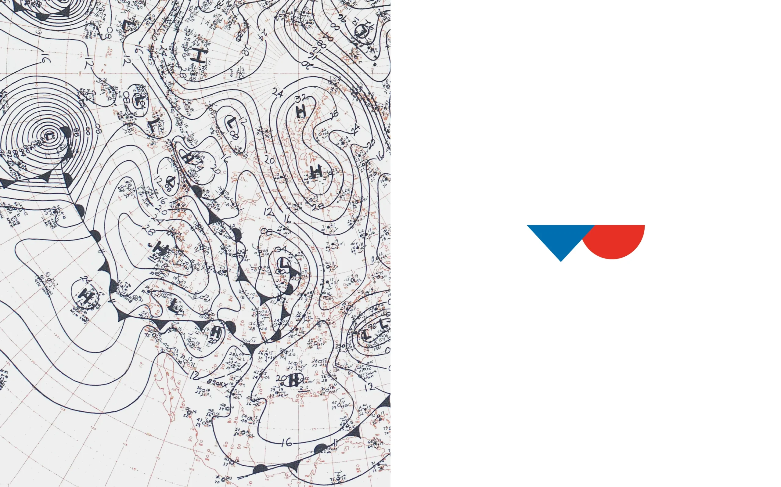
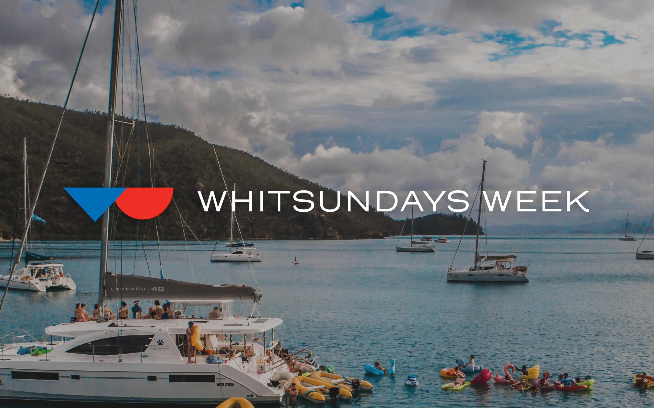
The challenge of the new identity is to capture the essence of their business, which is all about sunshine and sea breeze. The logo mark is inspired by meteorological symbols of cold fronts and warm fronts, where atmospheric temperature difference creates wind. Vibrant warm red and blue were chosen to capture the feeling of a radiating sun and make it eye-catching in all environments. Together with the use of white space and typography that creates an airy visual language, the new identity perfectly delivers the atmosphere of their trips.
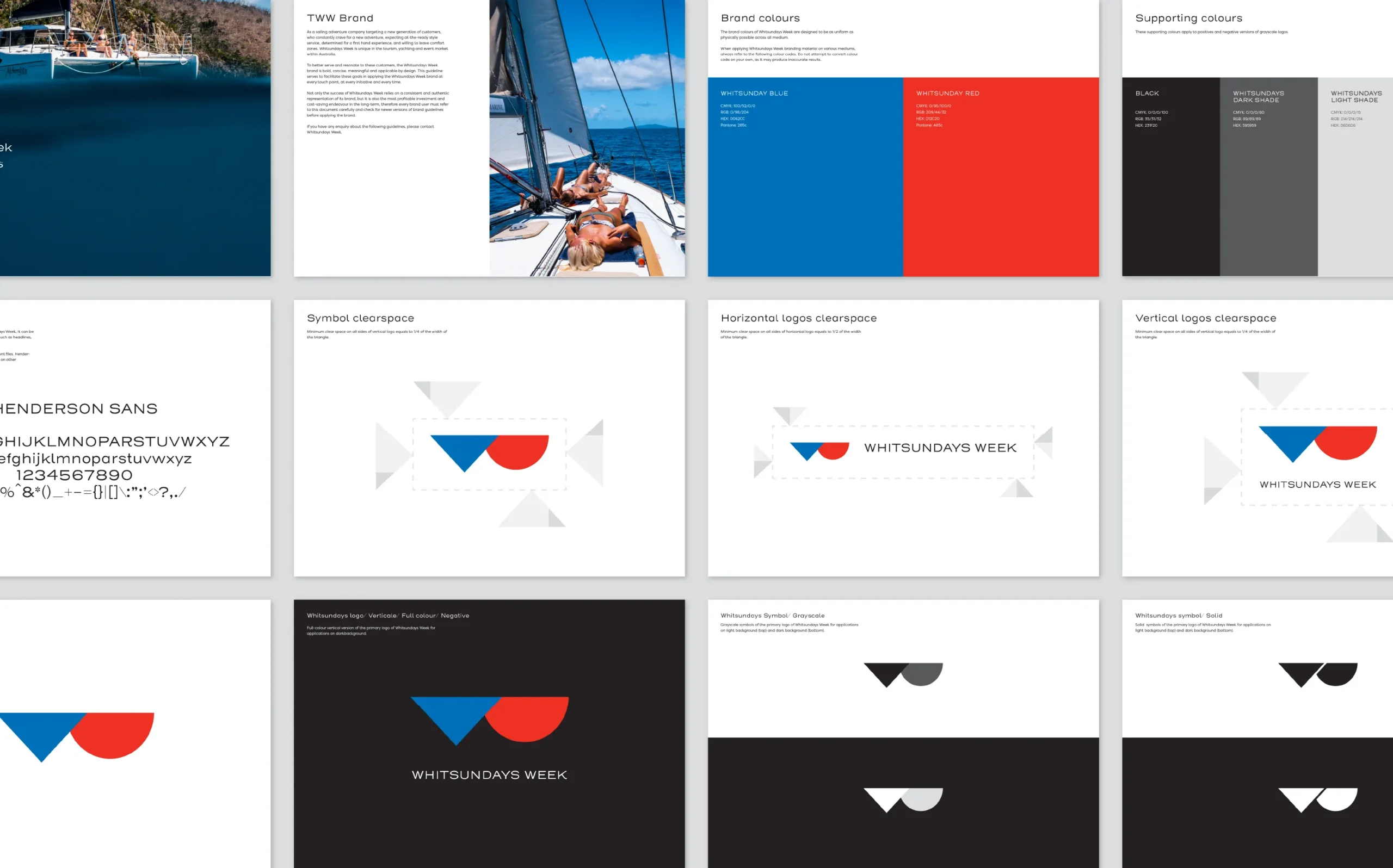
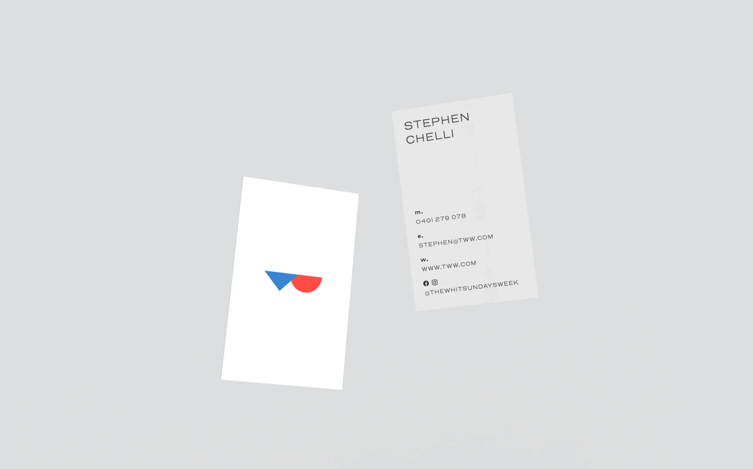
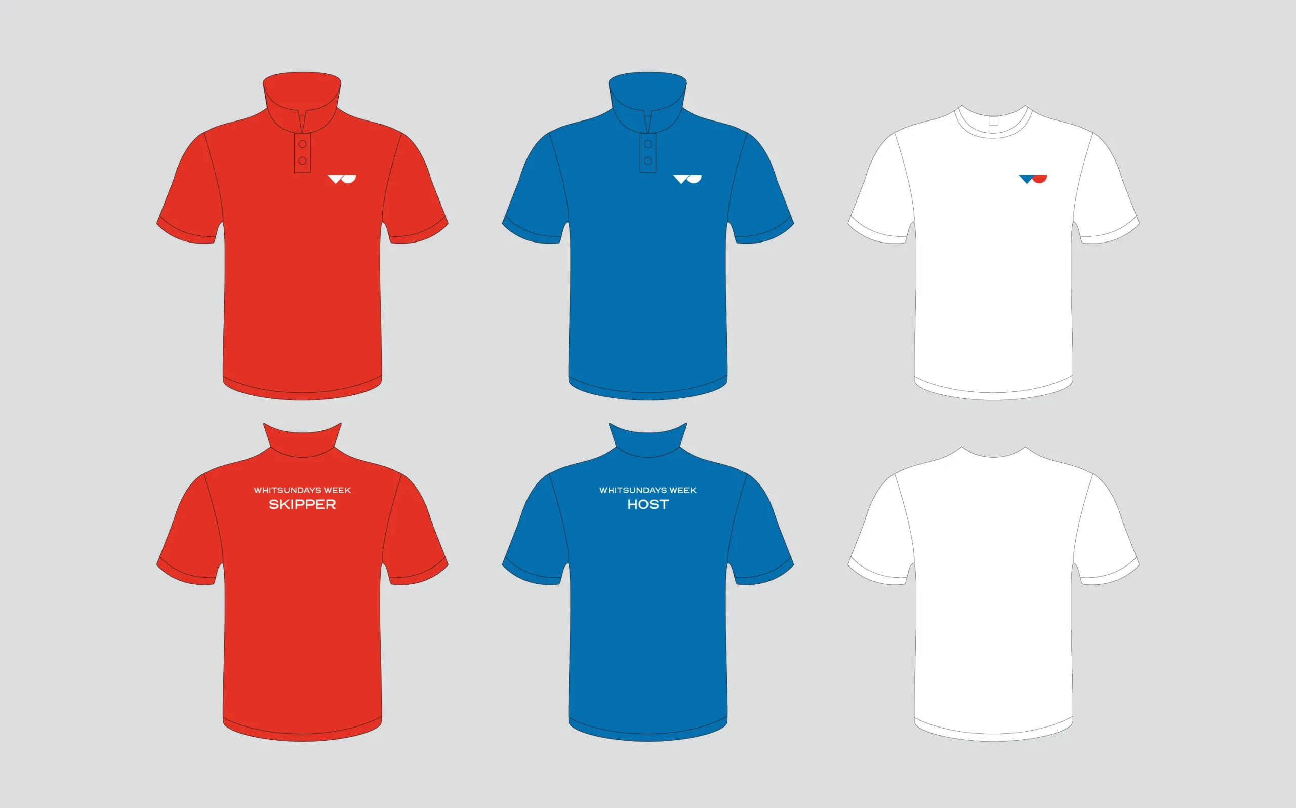
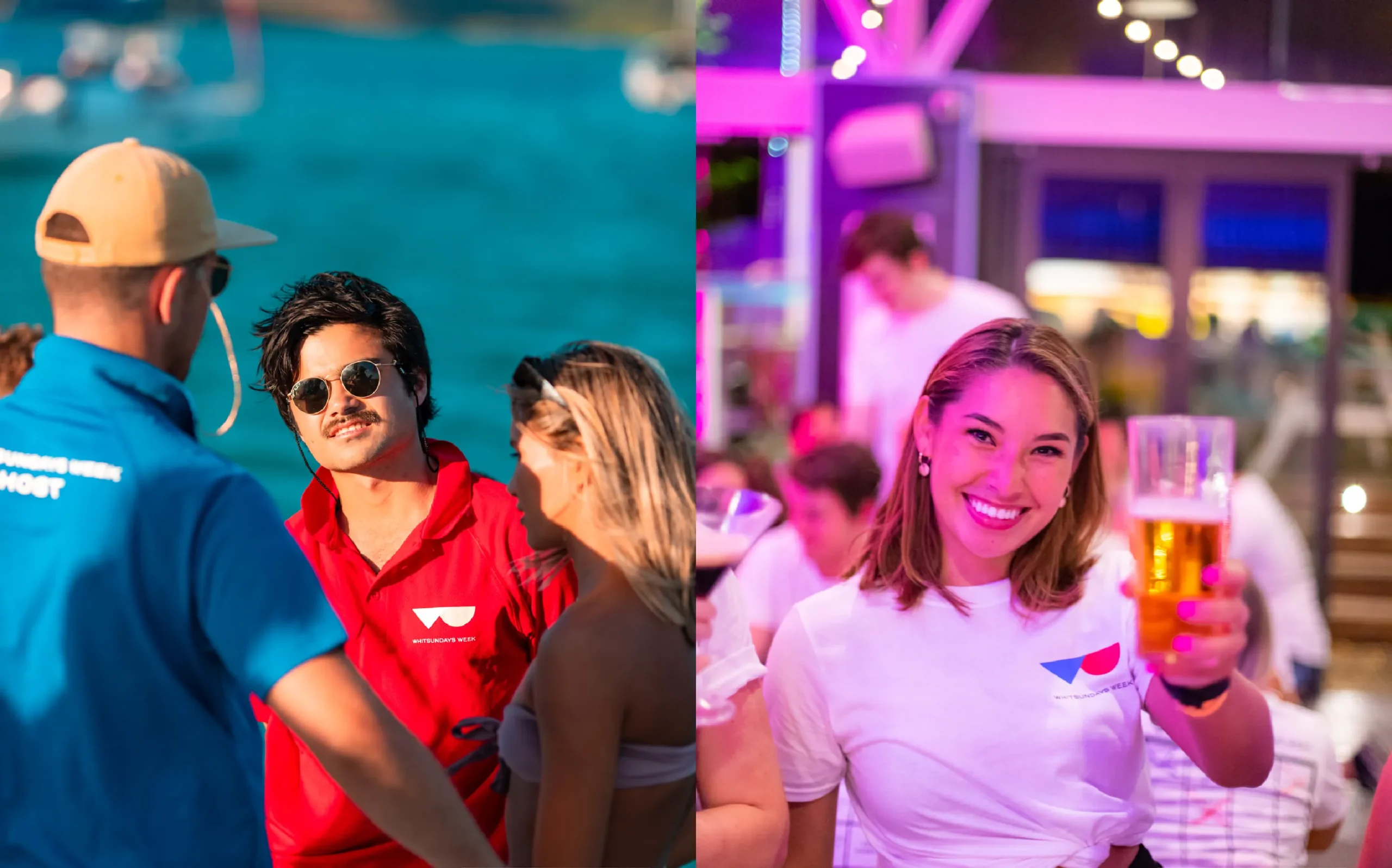
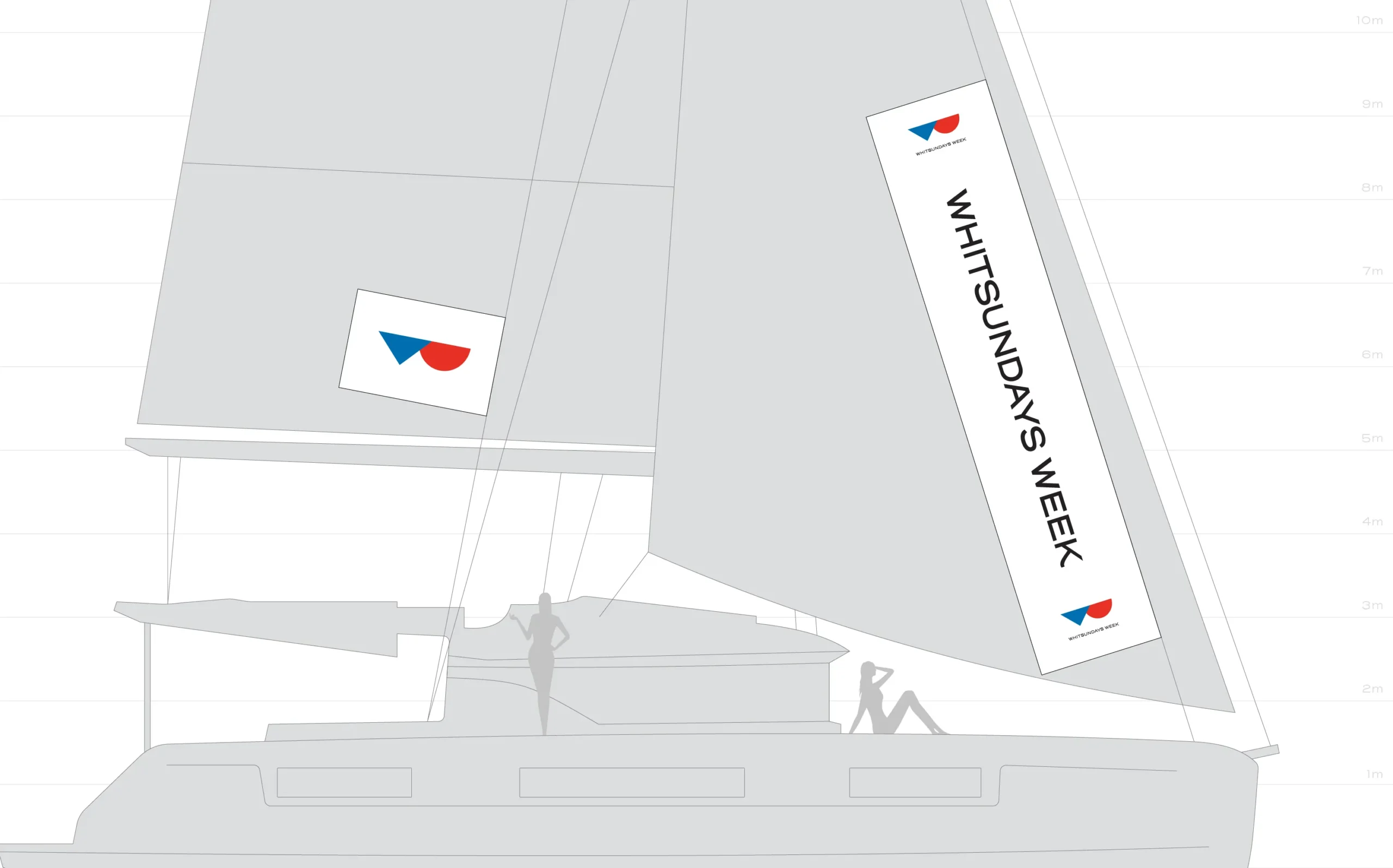
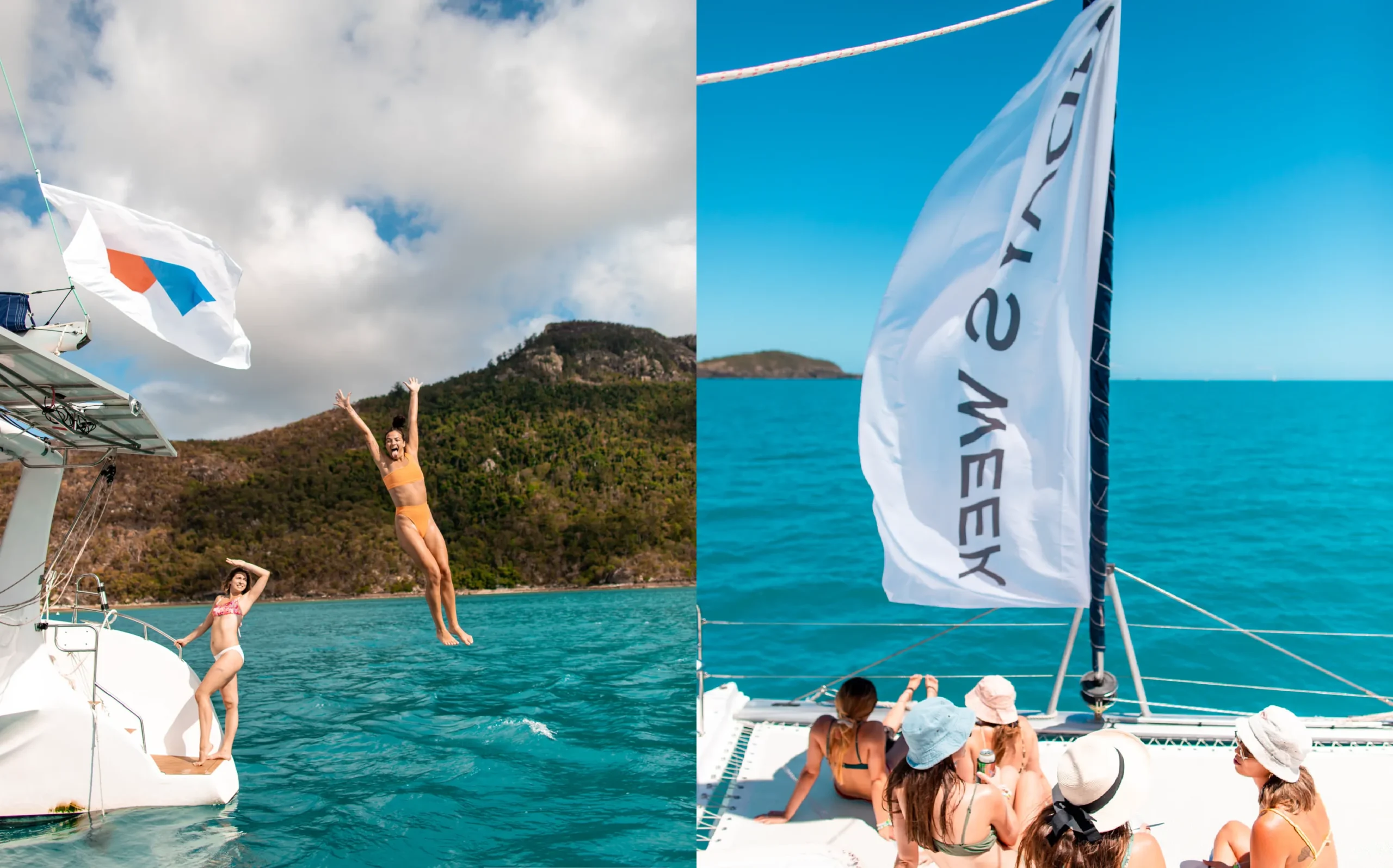
The new brand identity was adapted into various digital and print materials, including promotional materials, apparel, and other collateral materials. A style guide was also created to ensure that the new identity was consistent across all platforms, enabling a cohesive and recognizable brand. The final deliverables included a fresh, modern, and memorable brand identity that resonated well with The Whitsundays Week’s young adult target audience. The new identity perfectly captured the essence of their business, making it more appealing to their customers from all over the world.
