Identity and packaging design, for a unique Persian pistachio brand entering the Australian premium health food market.
Read details
BAZZAZ is a premium pistachio brand that stands apart from the commonly seen mass-produced and bland green pistachios, their iconically red pistachios are grown on their desert farm in Rafsanjan, Iran. Targeting health-conscious, active and global-minded young adults in Australia, being healthy means more than just taking care of the body, but also nurturing the mind and soul.
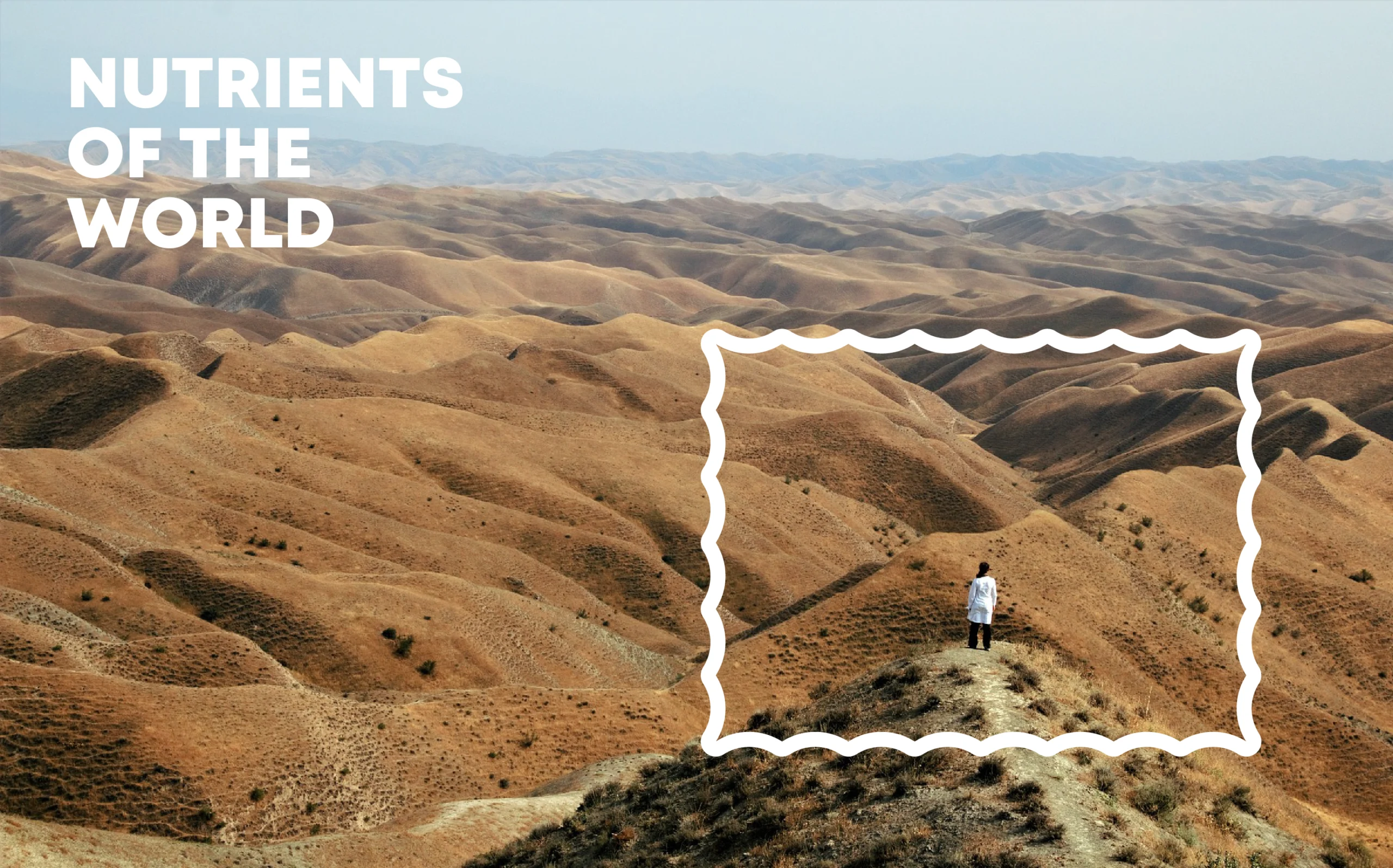
Wanting to go beyond the self-boasting dialogue of “where it is from” and “how it is made” commonly seen on gourmet or health food products, the brand wants to add “what is it like” to “where it is from” by building upon the narrative of “Nutrients of the World”. While “nutrients” are the product, “world” is the brand expression. From logo, packaging, brand elements and experience, everything aims to bring forth a send of the world.
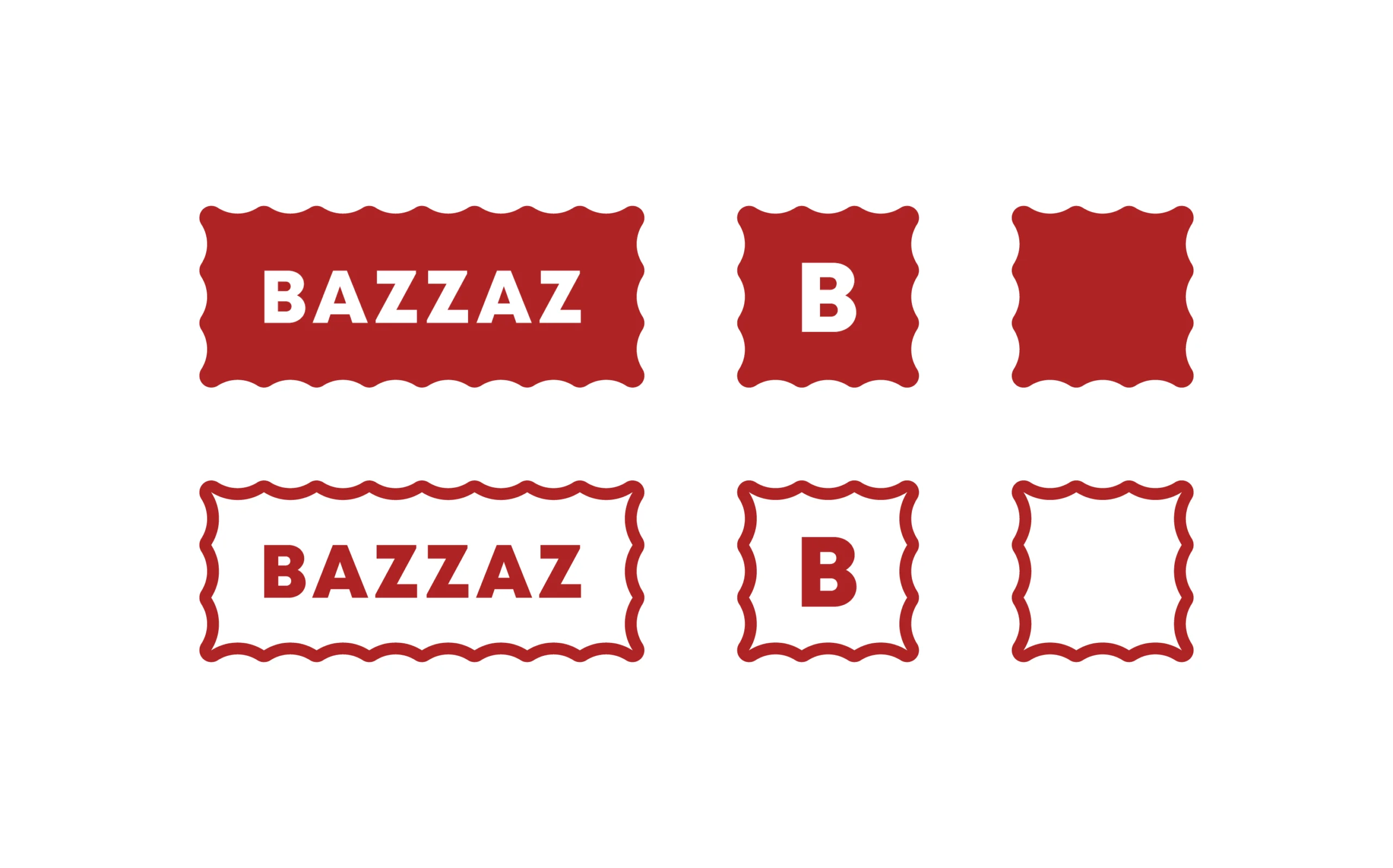
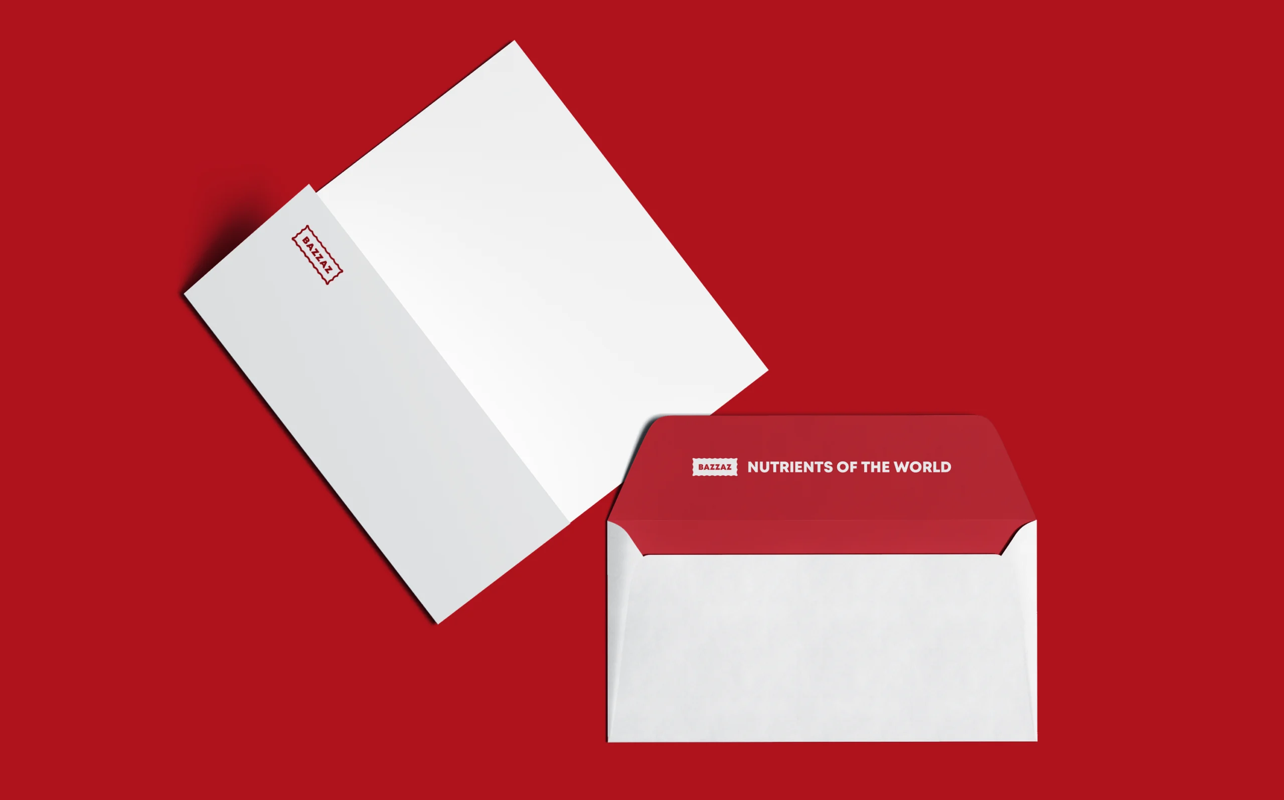
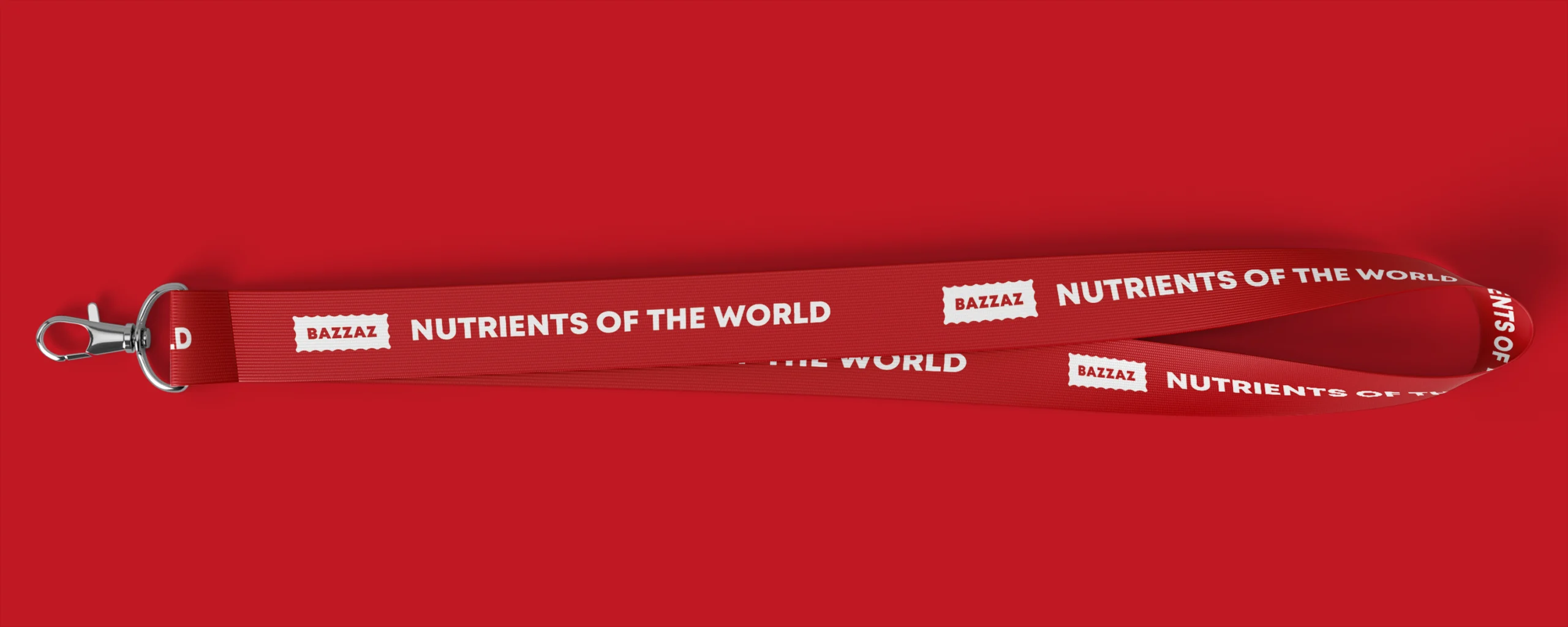
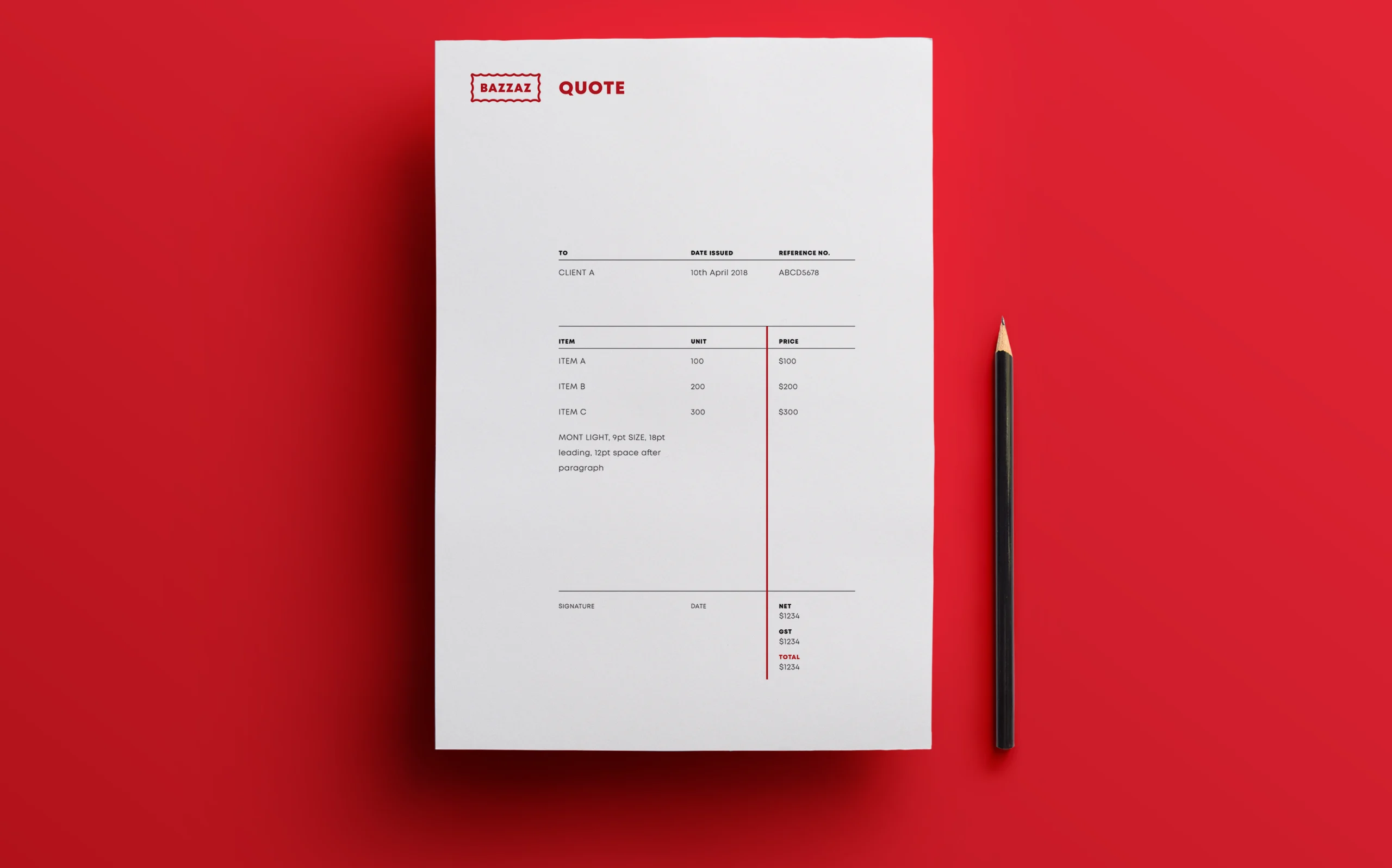
As a symbol of life and energy in Persian culture, and being the colour of BAZZAZ’s unique pistachios, red is chosen as the brand’s main colour. The visual elements of the brand draw inspiration from stamps. The bold logo mimics a stamp and supports brand elements based on stamp perforation, adhering to the brand narrative.
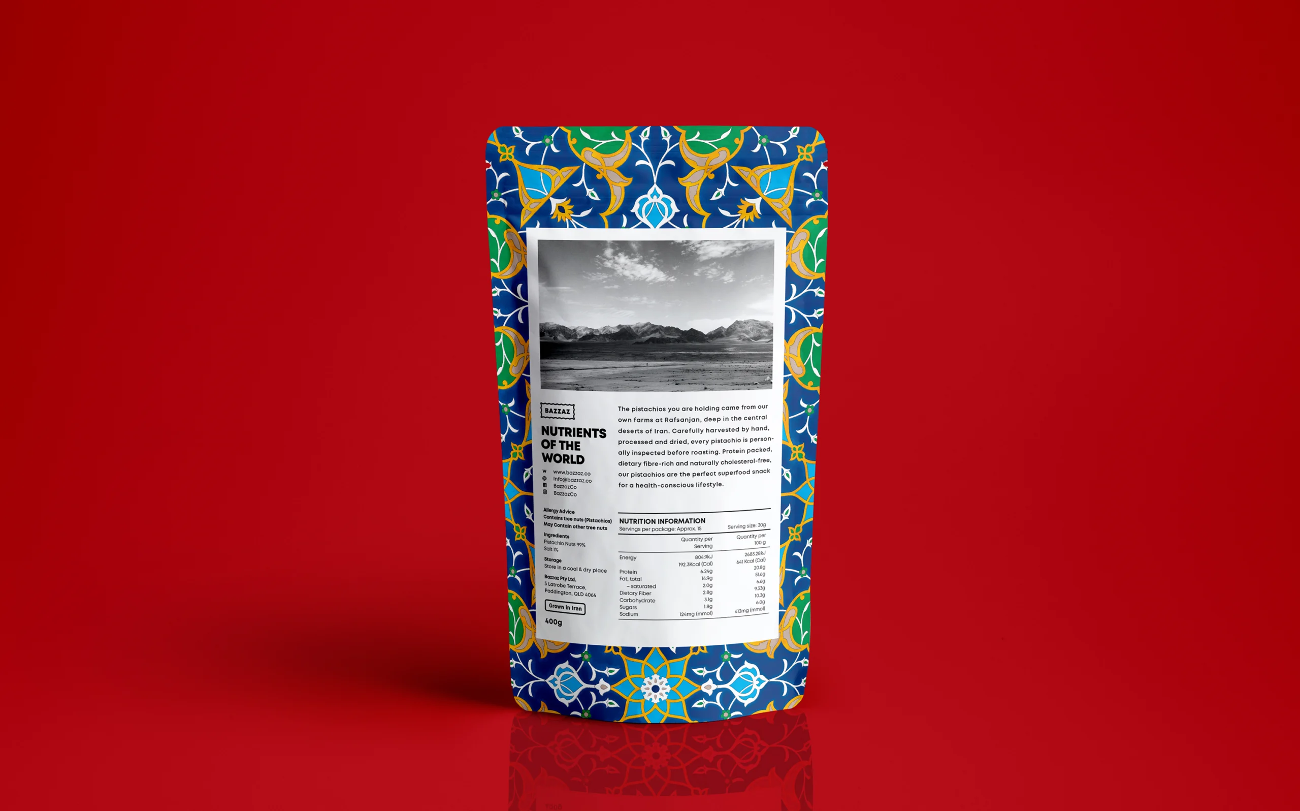
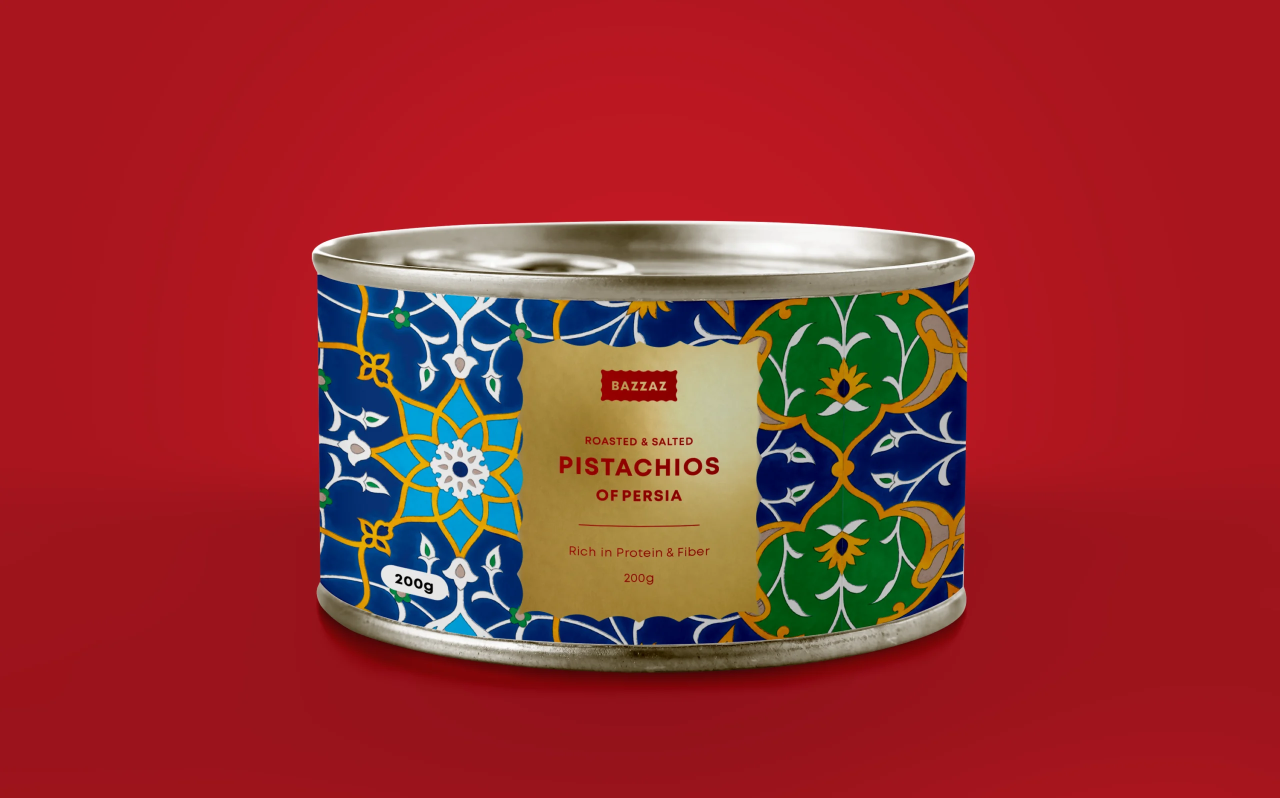
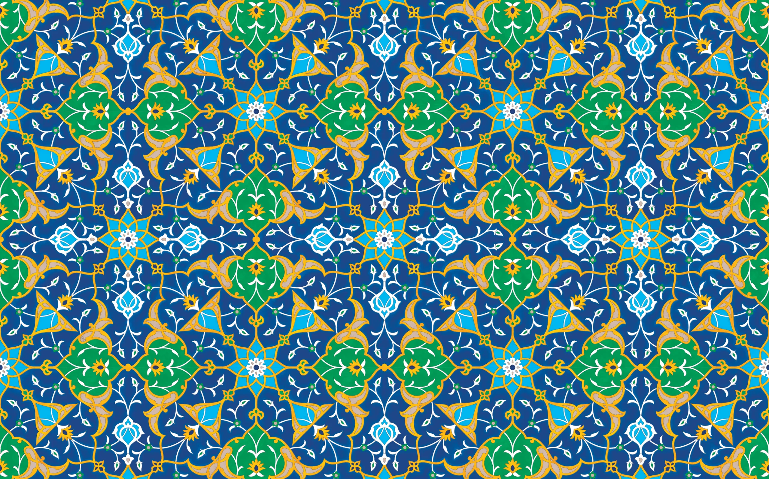
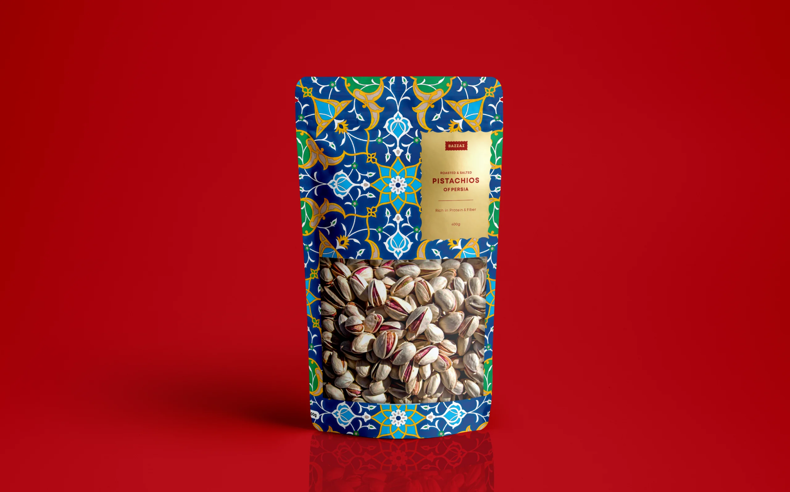
By introducing a custom design Persian pattern, the packaging not only stands out from competitors on the shelf but also brings a cultural element to the product experience. To make the packaging more tactile, a gold label in the shape of a stamp is placed in front, above the windows showcasing the pistachios, as if the pistachios were posted to the customer.
